CLIENT’S NOTE
Moodboard
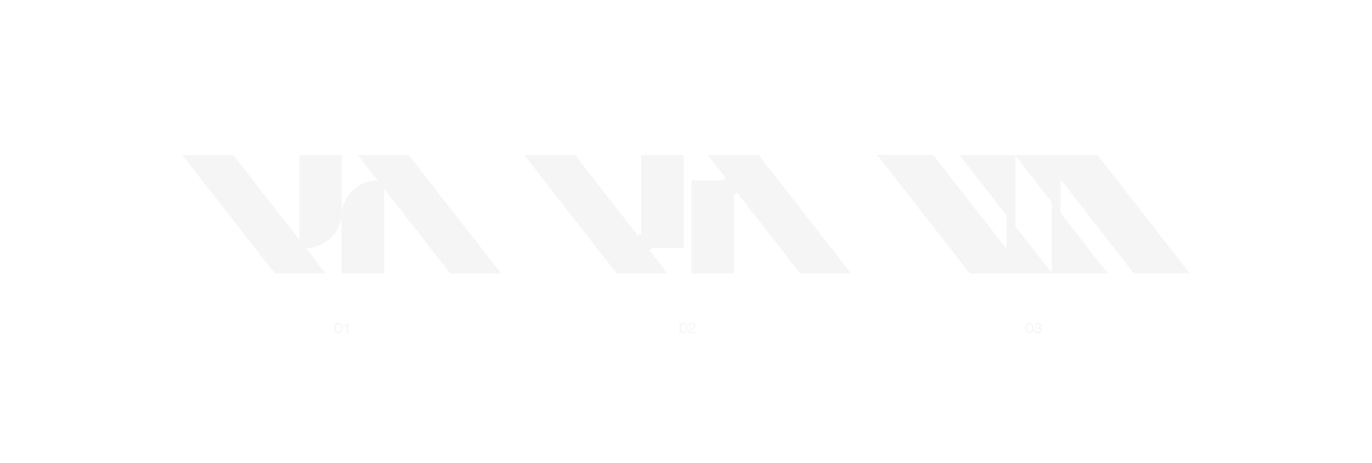
(01)
Our idea was to focus on angles and “VA” letter combination. Add rounded inktraps and also play around the weight of the stems and horizontals.
The goal is to find a good modern balance between brutalist and contemporary look, but also keep it professional, as it’s a design for a logo.
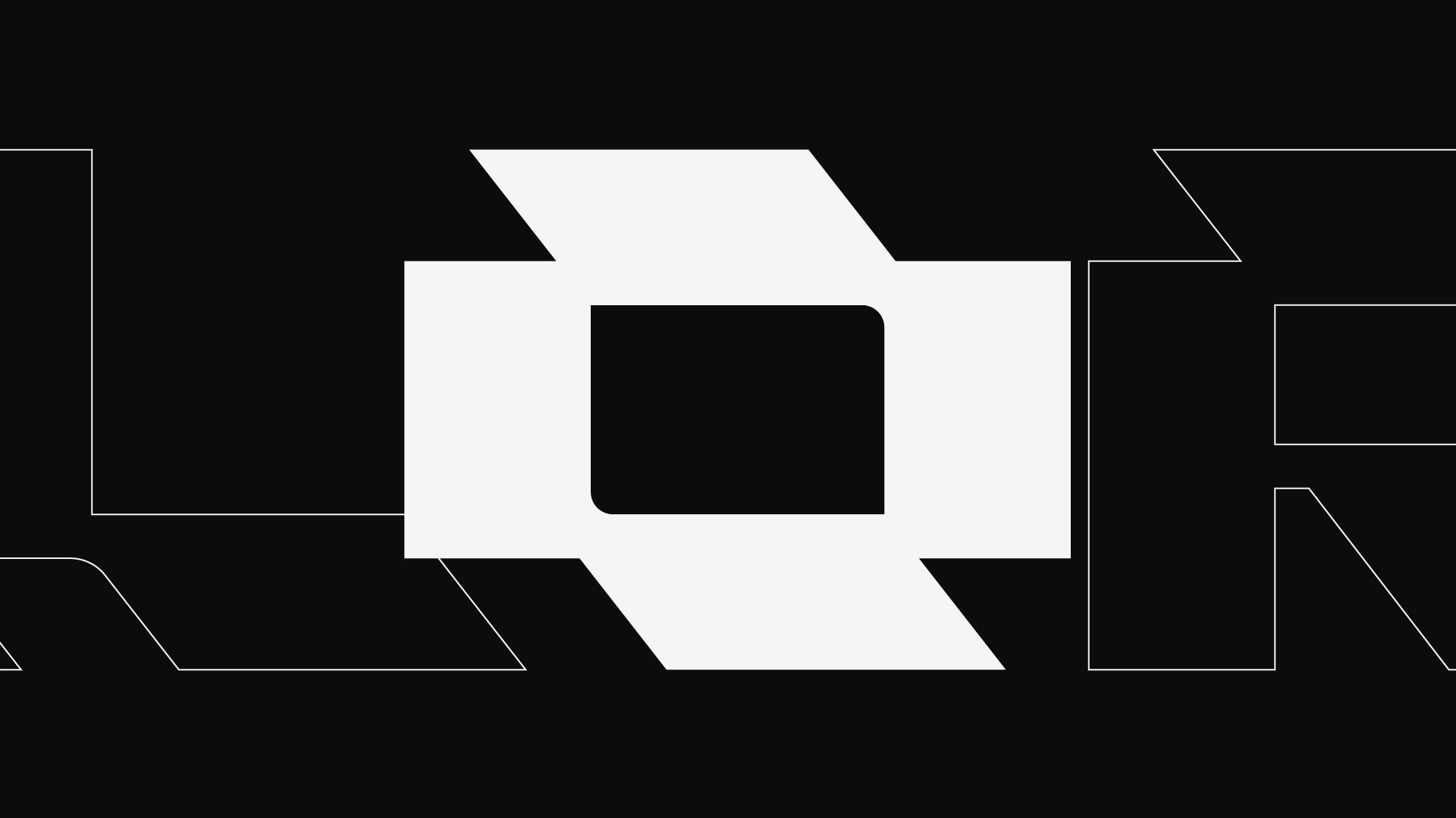
(02)
After we found a good balance between the letters V and A, we tried to unify the look and angles throughout.
We initially wanted a much more abstract “O”, but eventually we settled on a much more simplified version that better matches the overall look.
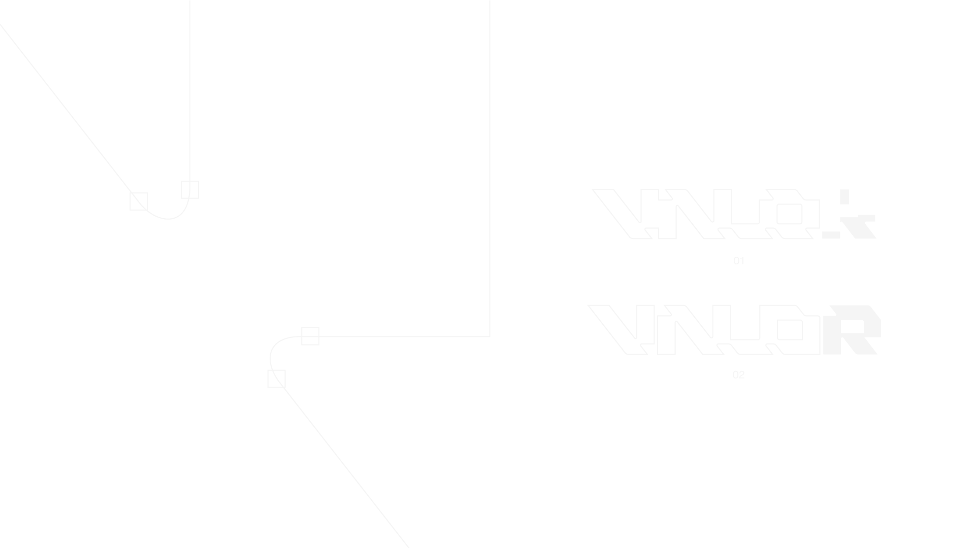
(03)
After fixing the “O” problem, we had a similar decision to make with the letter R. Long story short, we settled on the second version because it kept the logo coherent and closed.
And yes, we added some roundness to our inktraps and bleeds.
(04)