*This project is a conceptual proposal and does not represent a real, commissioned, or executed work.
Moodboard
(01)
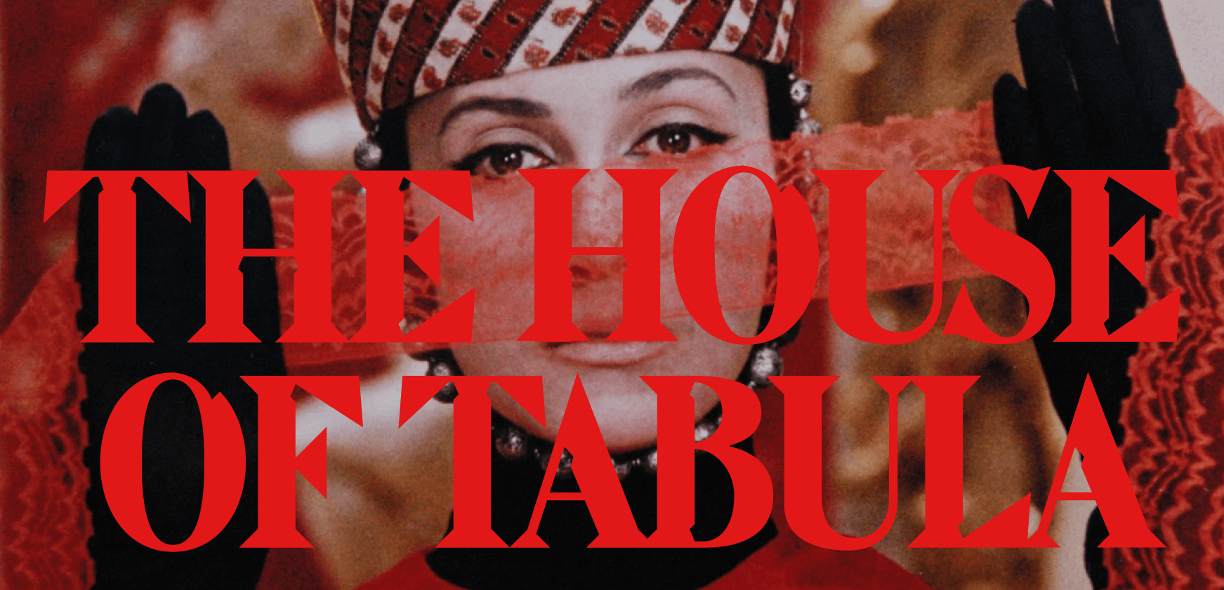
We have long been inspired to design a 1970s-style serif. As admirers of Cinema Cartography and House of Tabula, we felt a brand with such depth deserved a truly representative typeface.
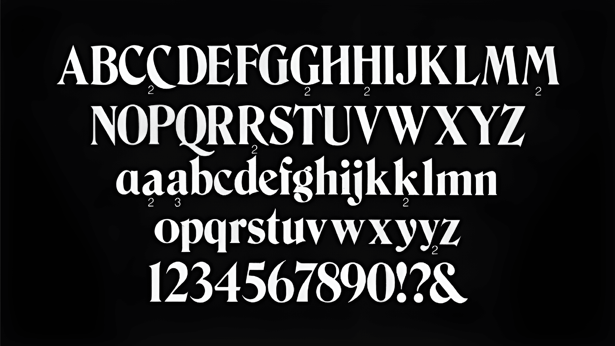
These are some of the first drafts for a font we never developed.
(02)
We wanted to stay true to the classics, reflecting the channel’s focus on 20th-century films, while adding a subtle modern edge. To keep that balance without drifting too far, we paired traditional forms with sharper, more emphasized inktraps.

(03)
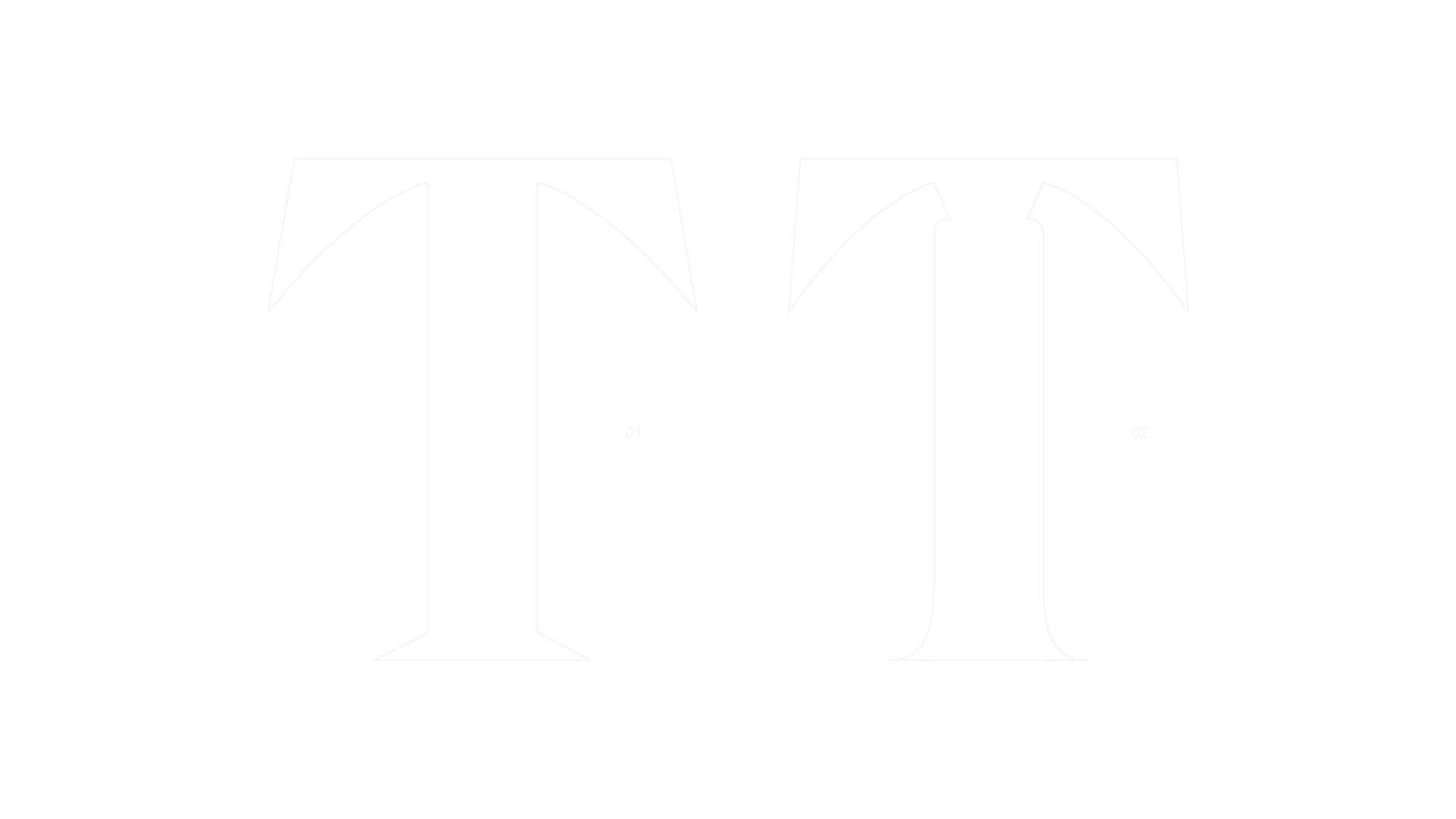
Once we defined the scale and character of the inktraps, we paired them with a serifs that matched. However, it felt too refined for the brand and didn’t fully reflect the channel’s identity.
So we leaned fully into angles and sharp lines to give the branding a sense of stability, rawness, and depth.
(04)
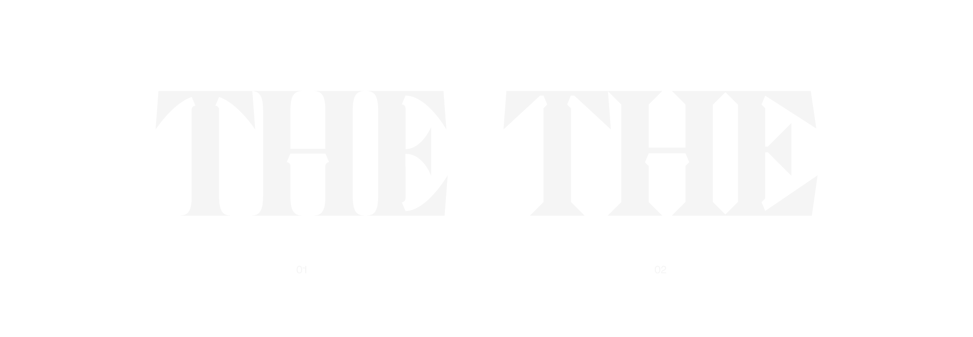
And that’s pretty much it. We went through all the letters, updated them accordingly, and tightened up the spacing a bit to get it to a finished point.
We did like the version with curved serifs and more elegant lines, but it’s not always about what looks the nicest. It’s about what actually carries the message best.
