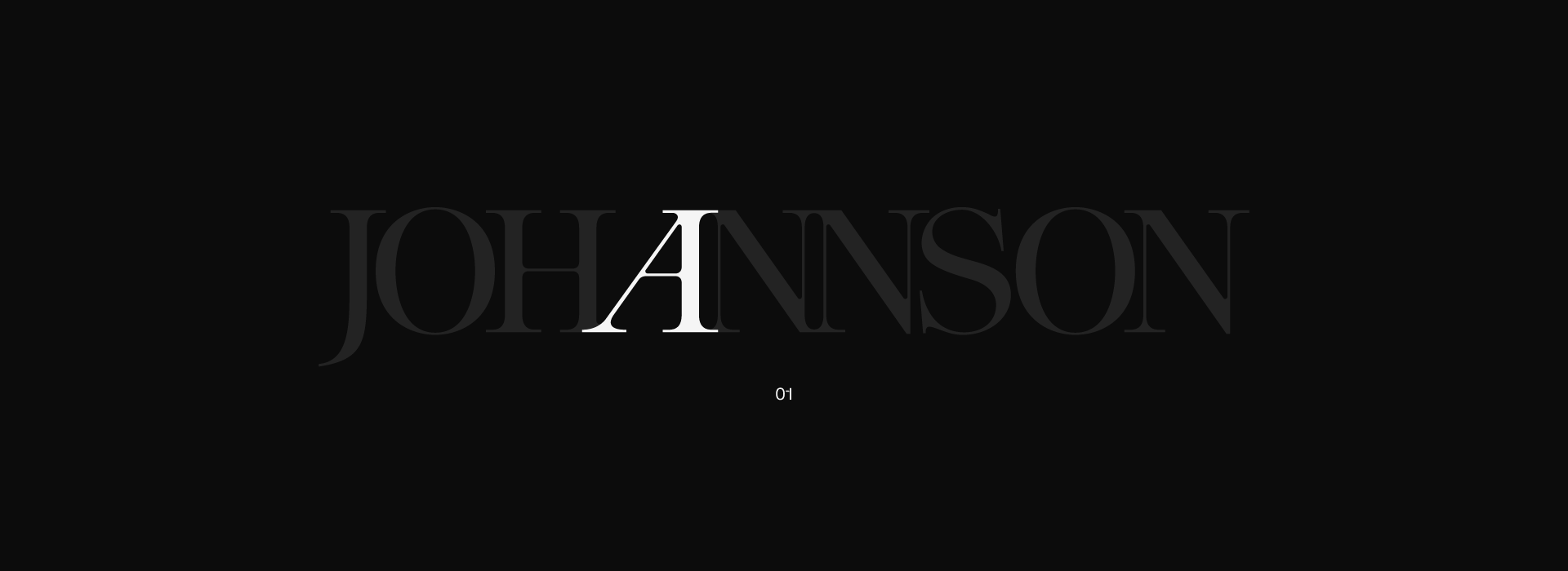
After seeing how well the letter “A” played off the sturdier, boxier shapes in the set, we knew we had to turn that inspiration into a font.
Moodboard
(01)
We initially attempted to expand this concept into a full alphabet, but faced significant challenges with spacing and stylistic consistency.
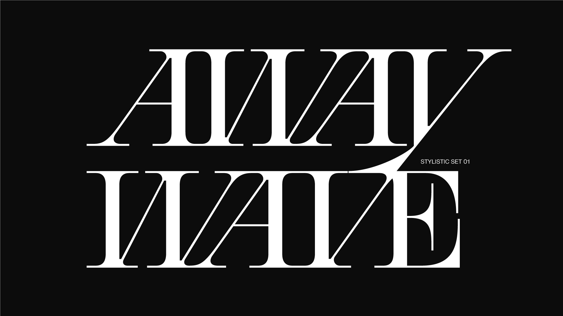
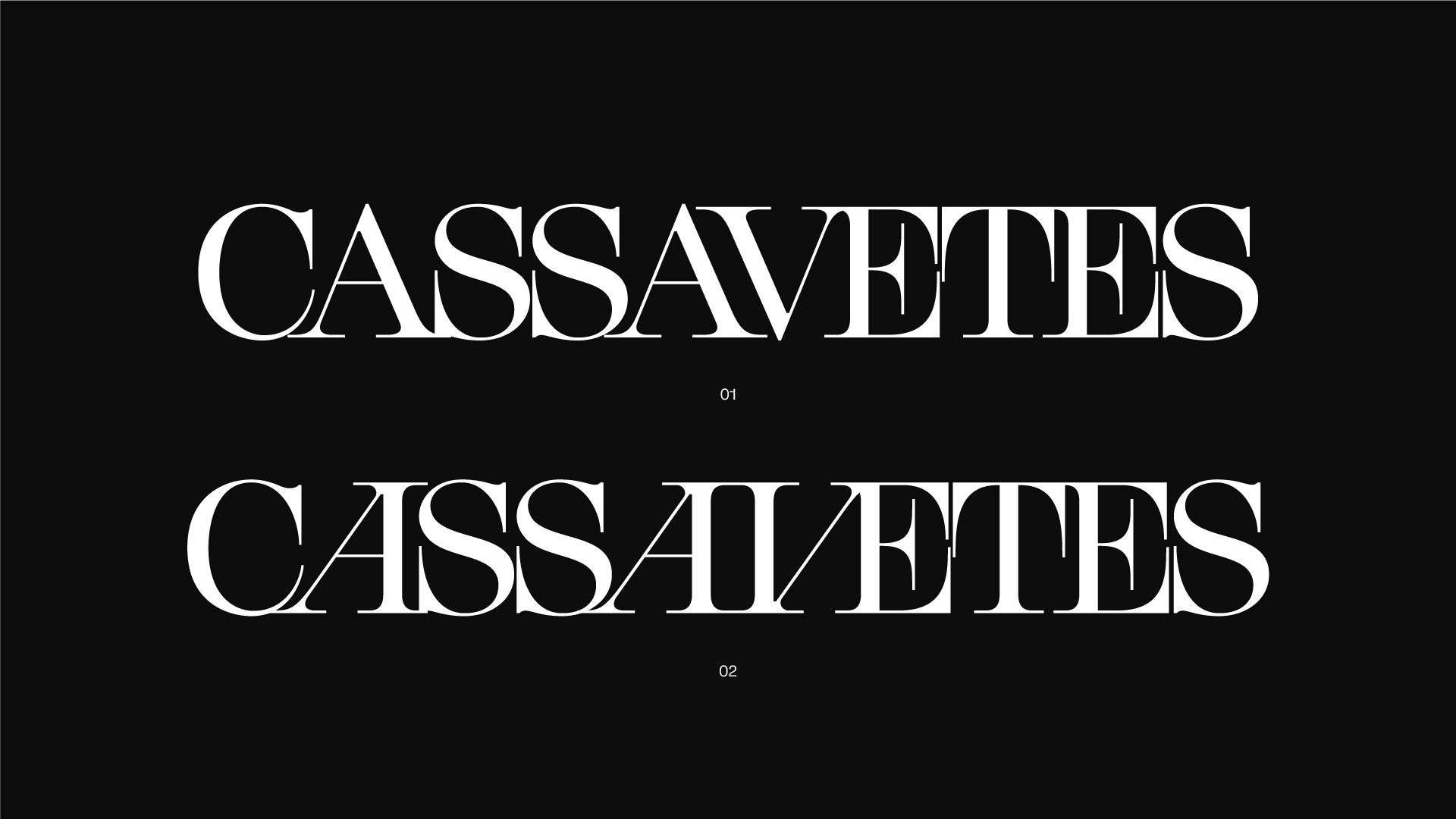
To resolve this, we developed a curated stylistic set of five characters designed to be combined into visually harmonious compositions.
(02)
We’ve enabled easy access through OpenType features so you can mix and match letters however you like.
Since every language handles combinations differently, we felt this flexibility was a must-have.
(03)
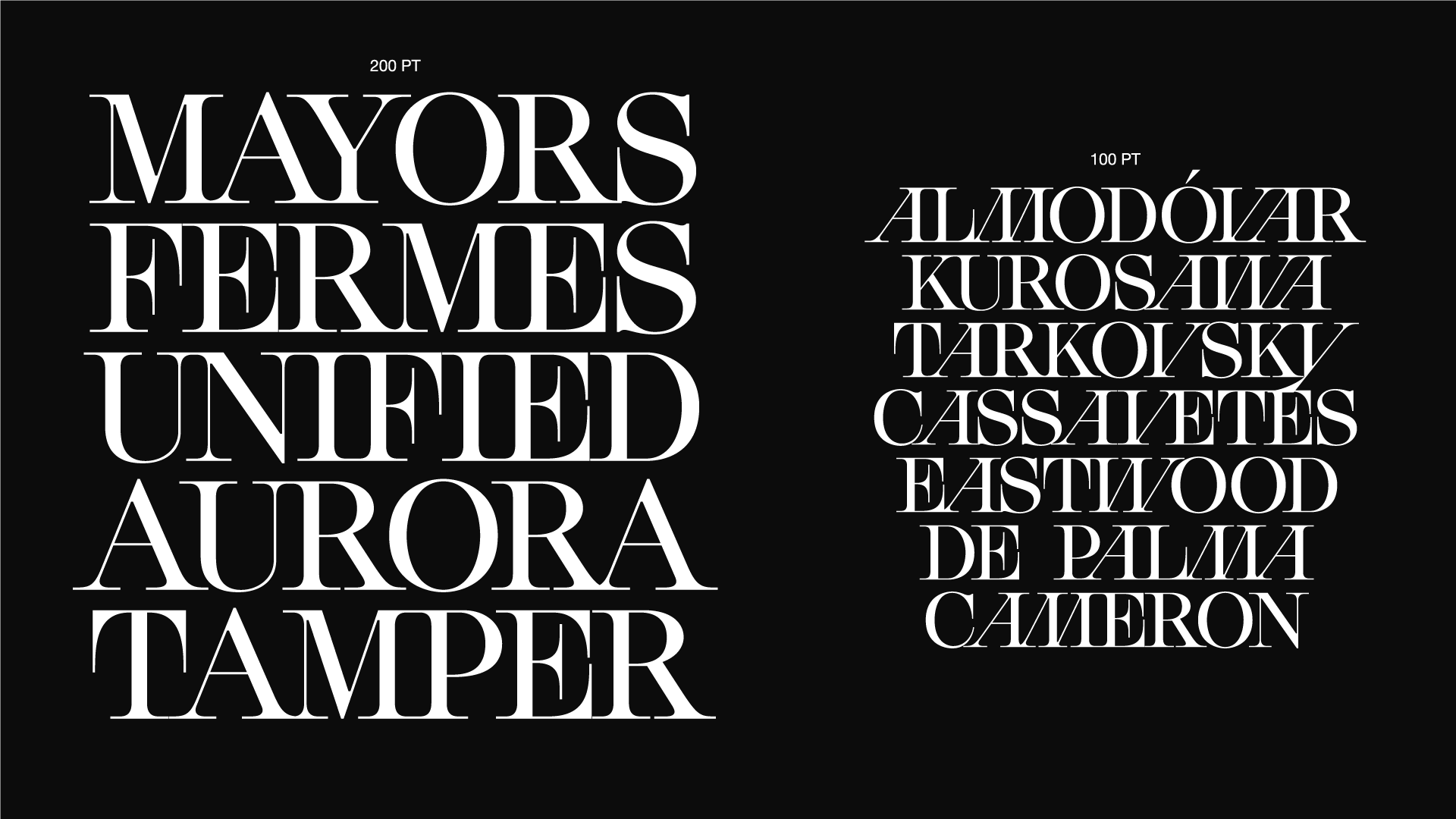
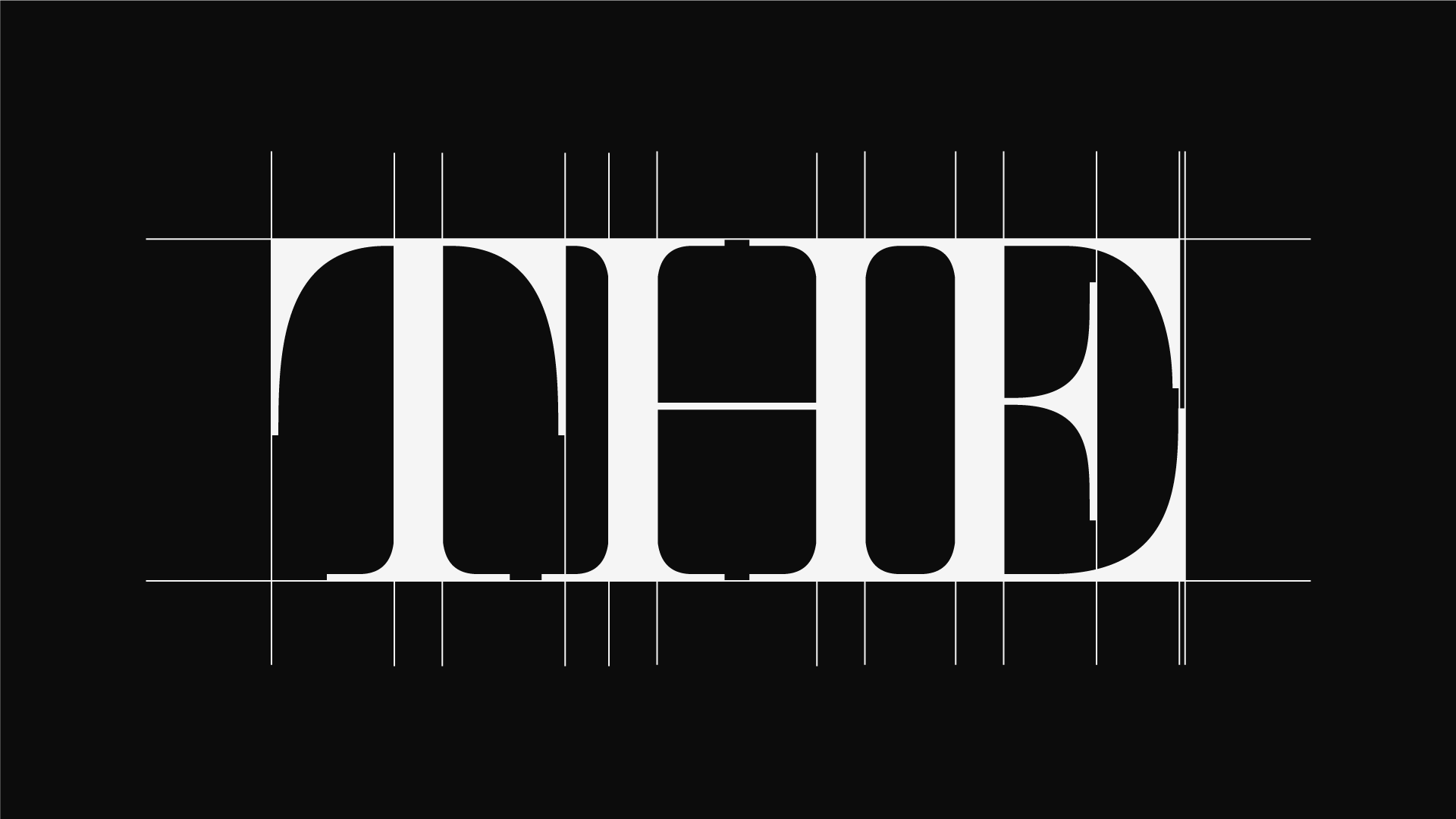
Our vision for this typeface centers on a rigid, boxy architecture. We intend to harmonize the rest of the character set by utilizing strictly 90-degree angles, particularly within the serifs.
By maximizing the scale of these serifs, we aim to achieve a hyper-modern edge that still retains the high-contrast sophistication of a classic Didot.
(04)
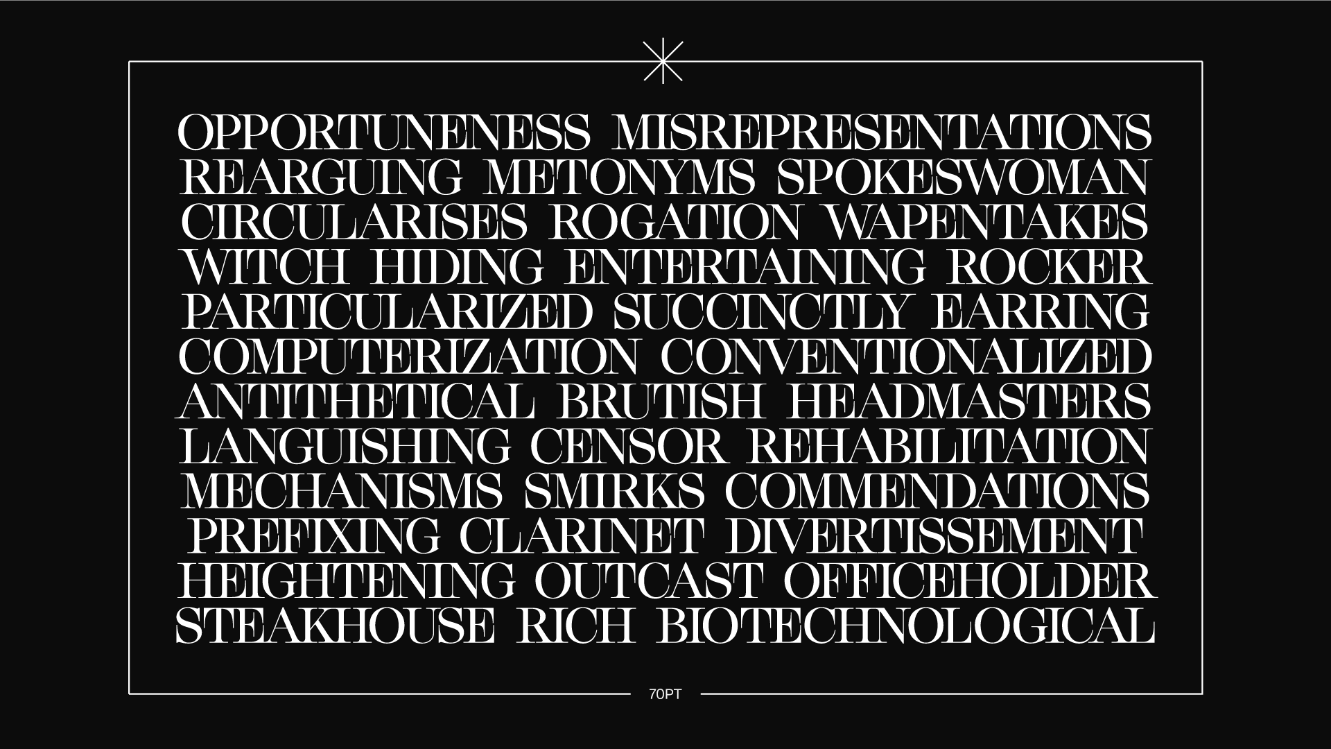
The horizontal serifs were intentionally oversized to mirror the font’s dramatic personality.
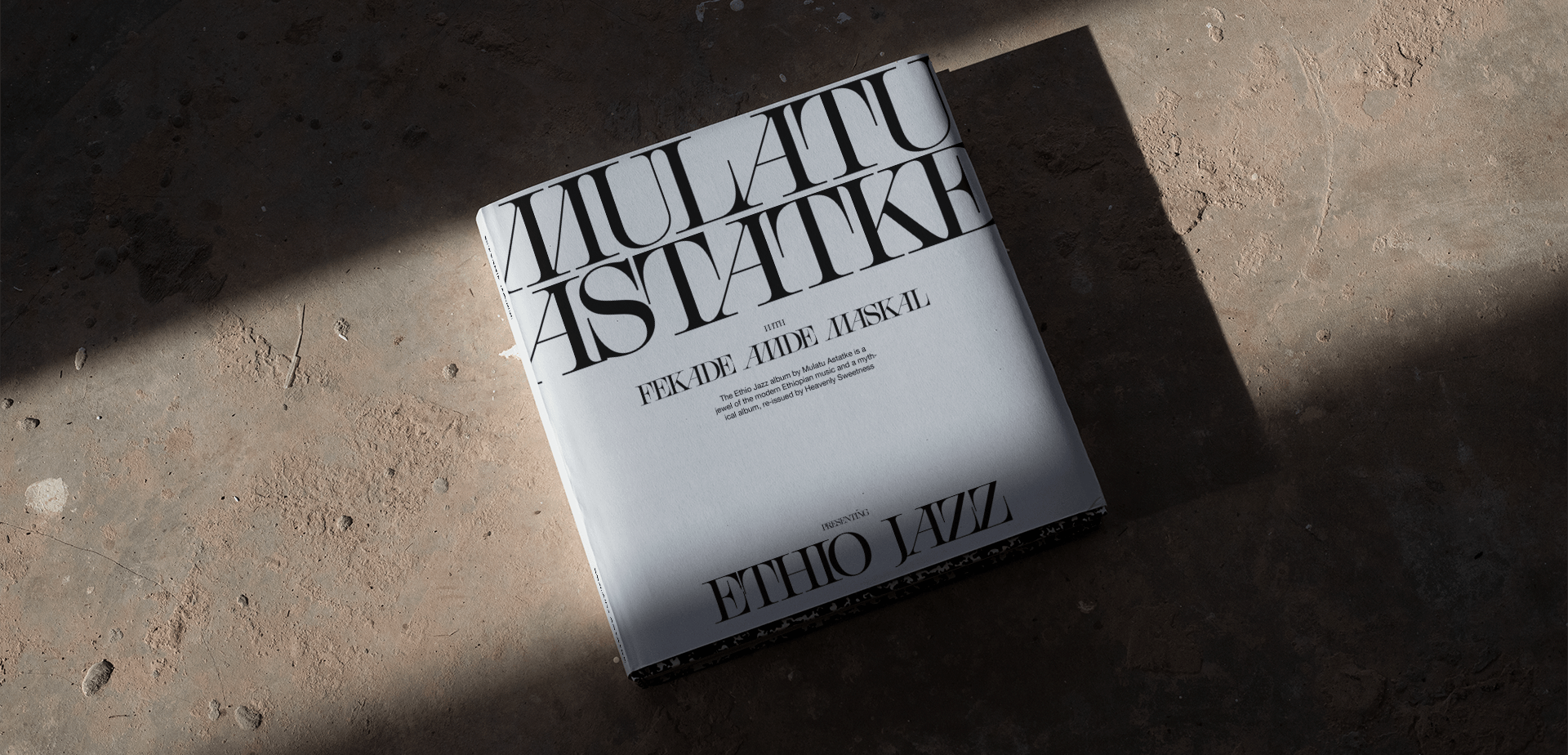
After refining the kerning and fine details, the result is an elegant Didone-style serif. This typeface further allows for the seamless combination of custom characters into any layout.