Moodboard
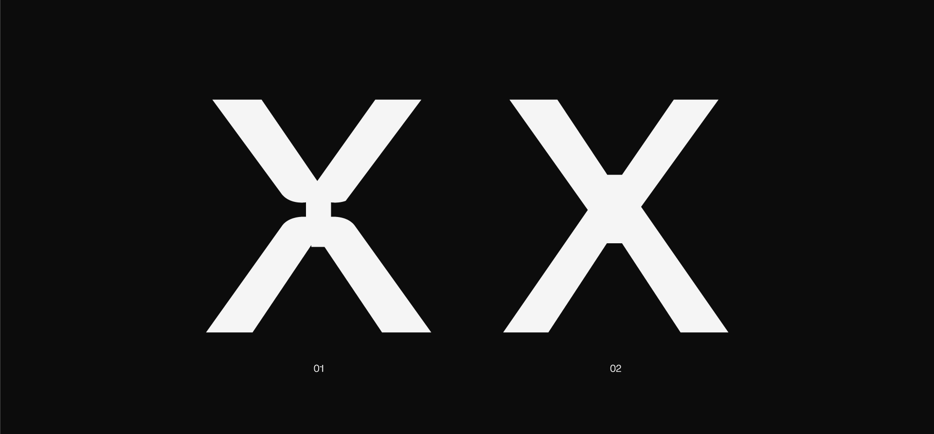
(01)
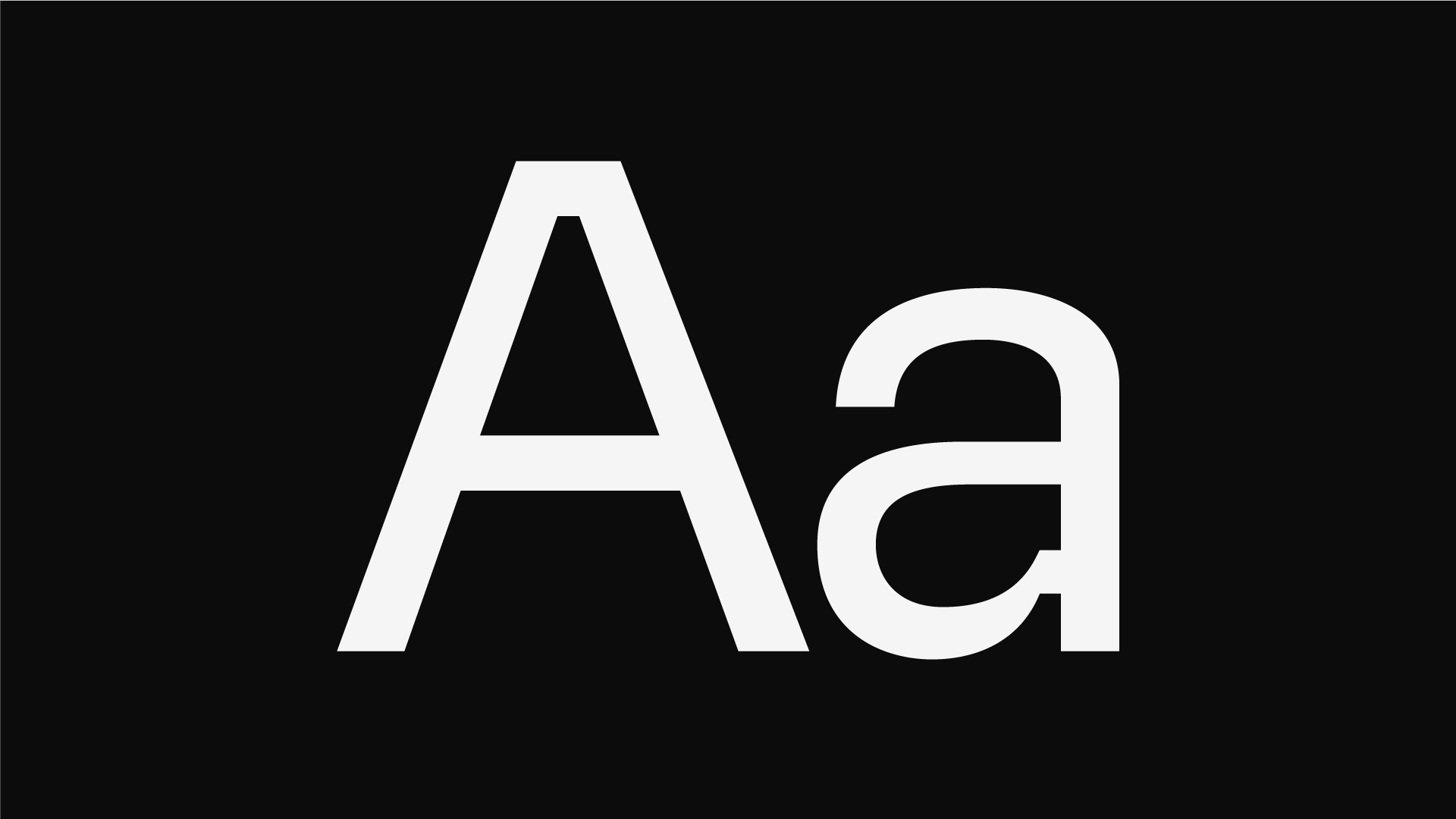
We took a classic sans serif and dialed the inktraps to the extreme. After testing various gaps between the stems and curves, we found a sweet spot that highlights those straight, recessed lines, making them the intentional centerpiece of the design.

(02)
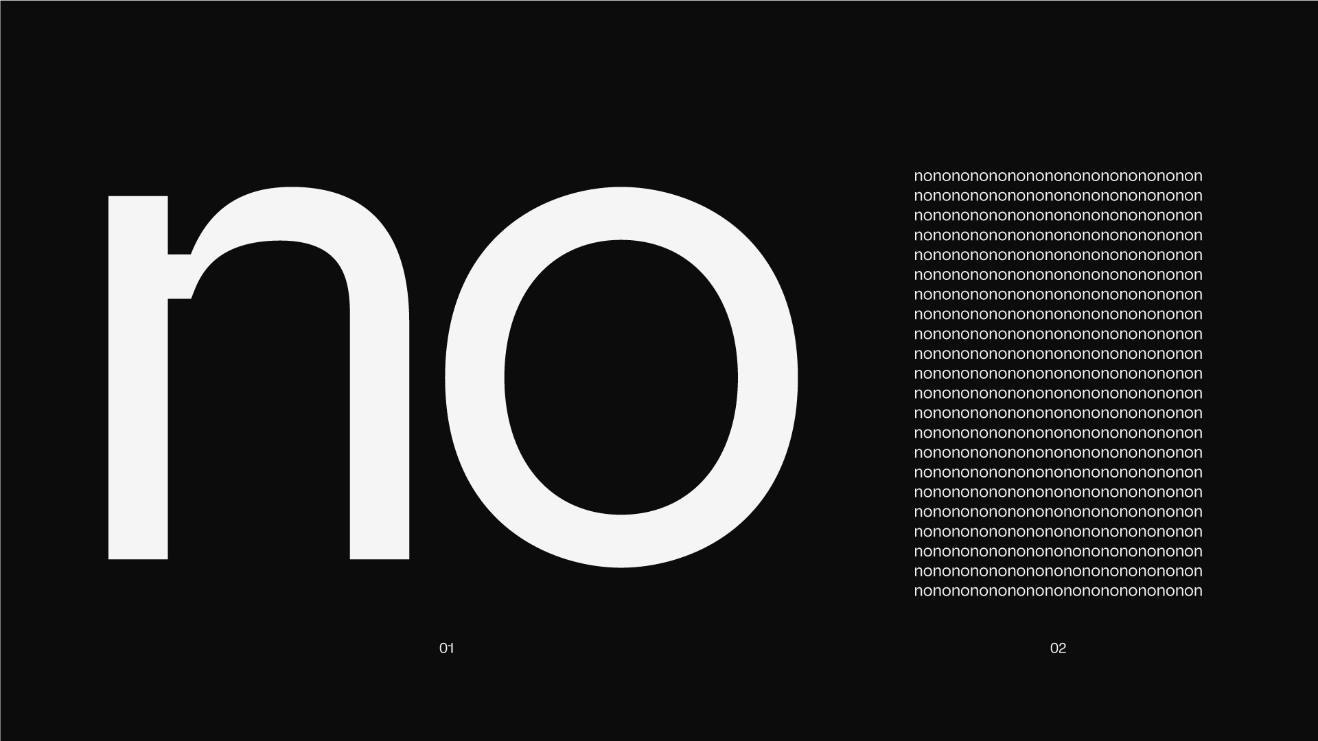
We stress-tested the design across every scale and hit on a killer duality: at headline sizes, the inktraps are a bold, high-tech statement; at body sizes, they vanish into the form, leaving you with a clean, highly readable sans serif.
(03)
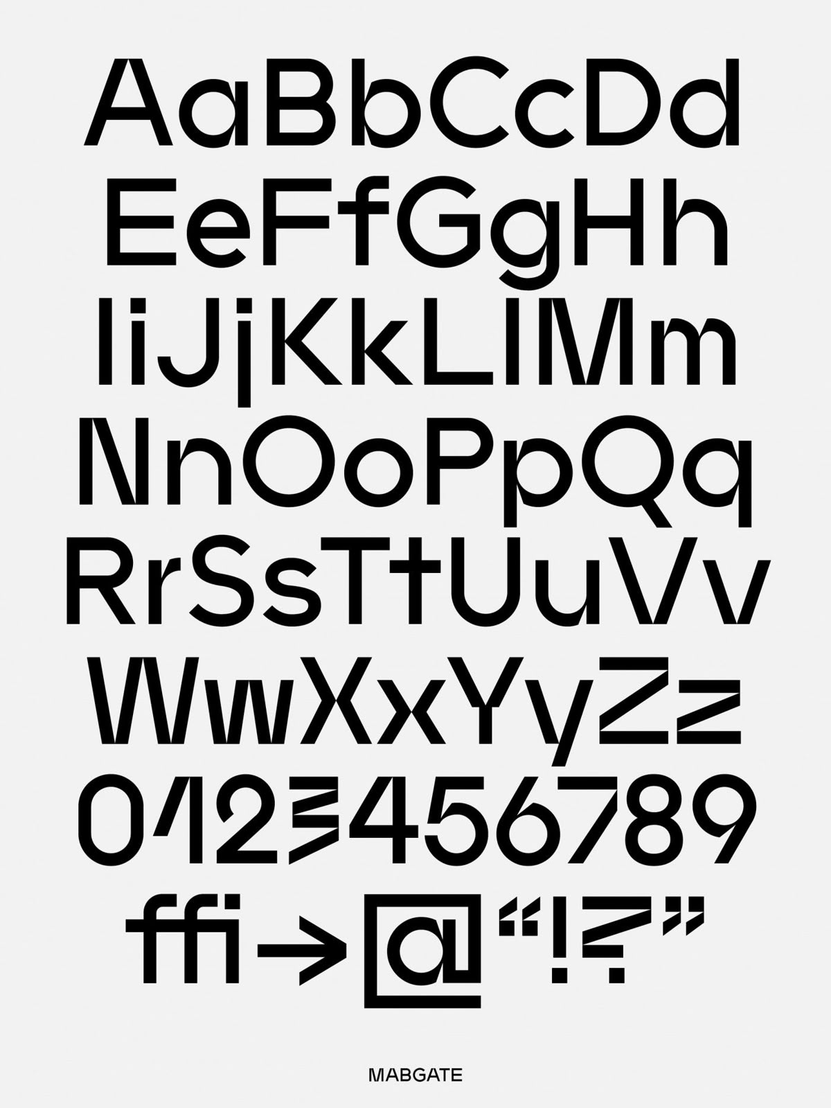
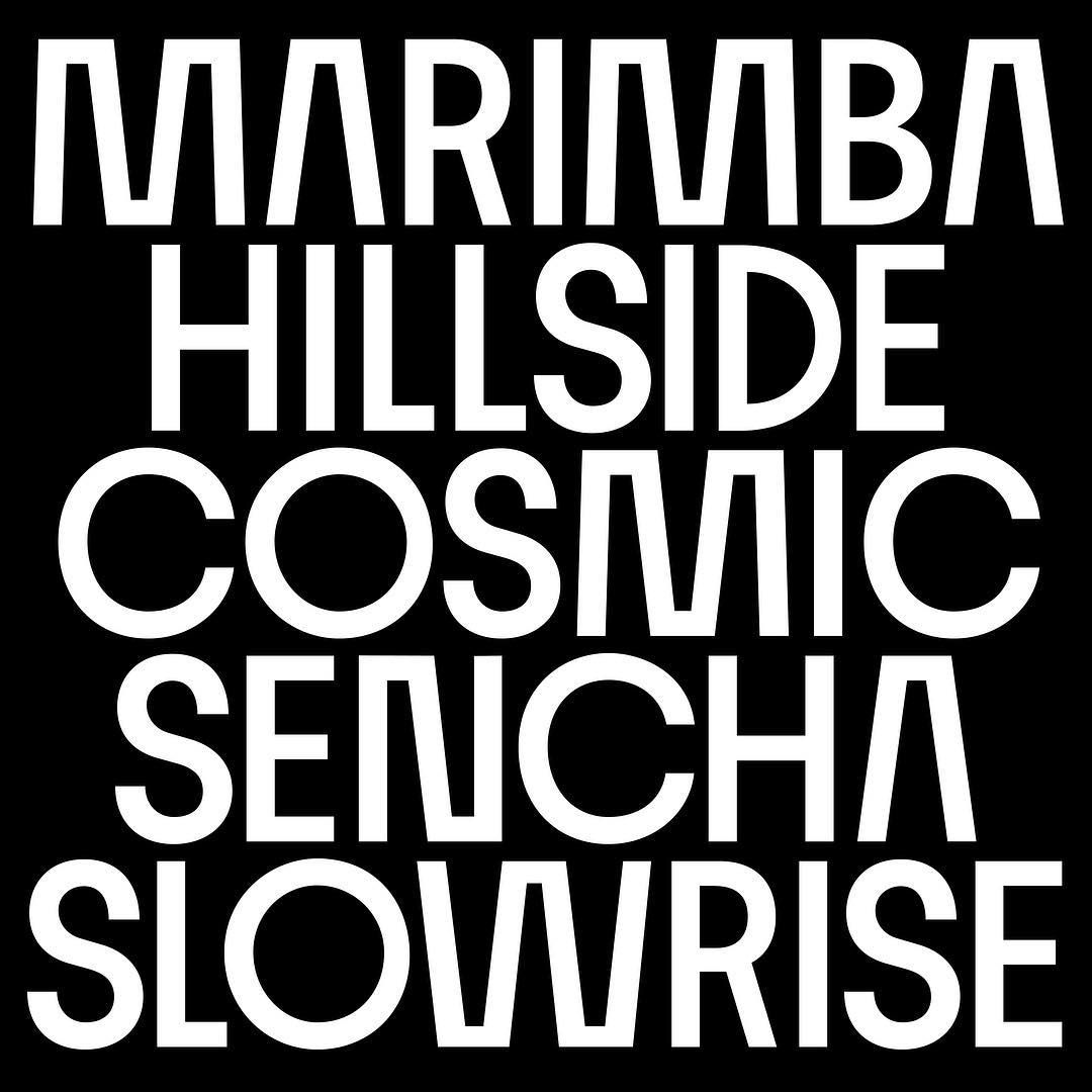
We kept the uppercase strictly classic, using subtle, uniform inktraps to mirror the DNA of the lowercase.
But for the lowercase itself, we went all in, cranking the effect to the extreme, especially where the rounded curves collide with the stems to create high tension results.
(04)
In the process of pushing the limits, we definitely crossed the line into ‘too much. We were left with plenty of experimental eye candy, but we filtered it down to the shapes that actually play well together.
That’s the beauty of proofing: finding the balance between a wild concept and a cohesive typeface.